Let’s fuel the wonder.
Global brand guidelines and design toolkit.Enfamil, an established and trusted brand in infant nutrition, sought to shine a spotlight on how the science-backed ingredients in their products play a major role in fueling an infant’s cognitive, physical, and social development. Instead of focusing solely on those often time-sensitive milestones, the attention was shifted towards those everyday magical moments of wonder that every parent notices and cherishes—the moments that spark a little one’s curiosity, make connections, try new things, and discover their potential.
While at MRM NY, I had the privilege of being part of the team tasked with bringing the Let’s fuel the wonder campaign to life. We established global brand guidelines and built a design toolkit to ensure that Enfamil’s core values and brand integrity remain cohesive across their product portfolio. The toolkit includes visual guidelines, branded elements, and design templates tailored to specific products, providing flexibility and guidance for customization to meet the needs and preferences of global markets.

LOGO
BRAND COLORS

TYPOGRAPHY

TAGLINE

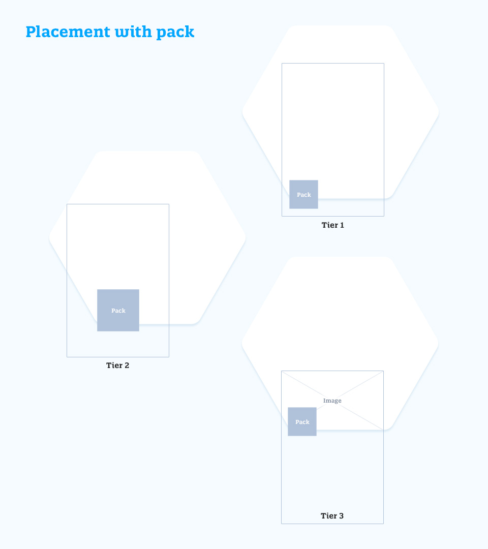
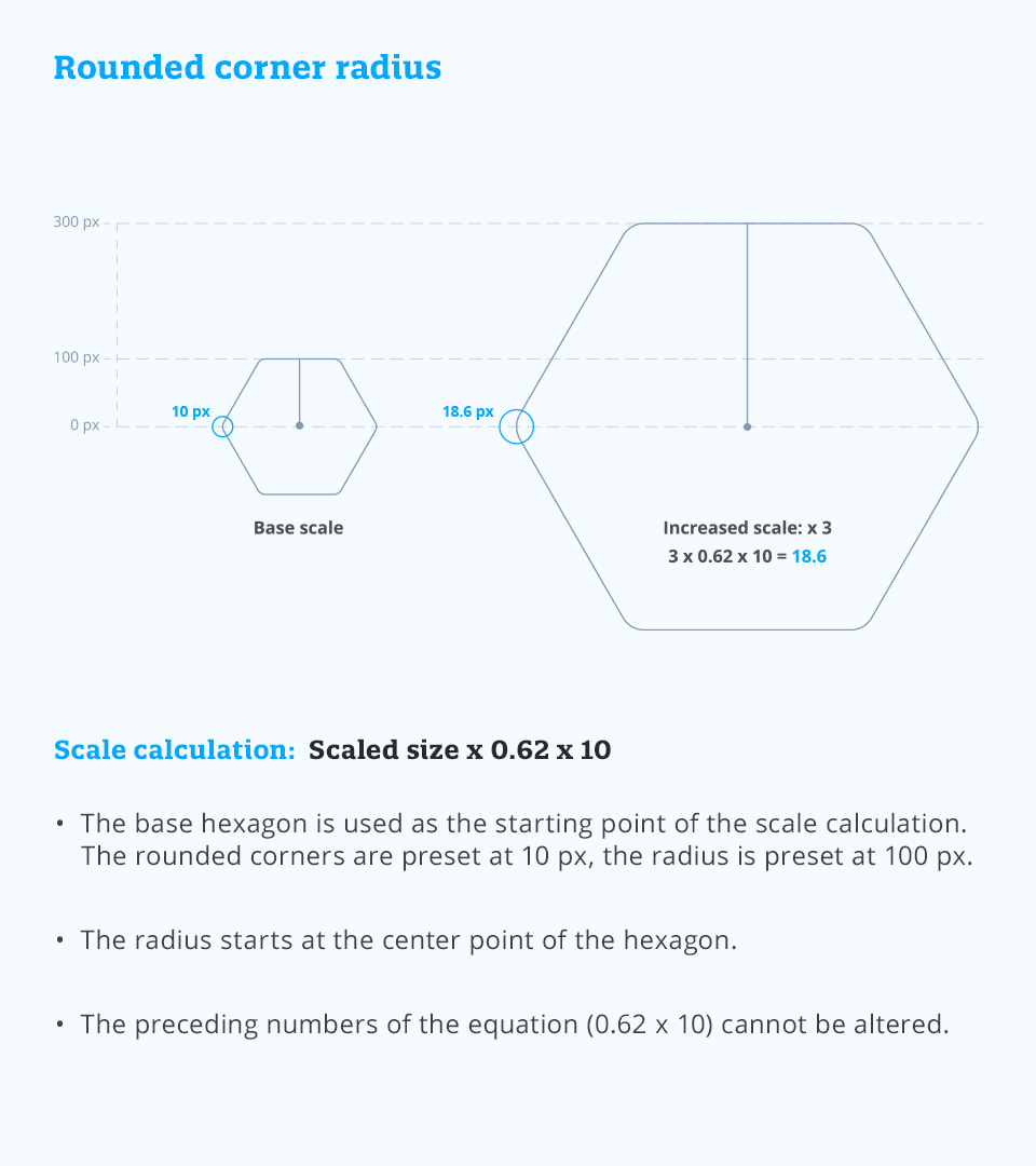
HEX EDGE
The hexagon is one of the primary components for building the scalable design system. By cropping and zooming into the hexagon, the hex edge is formed to provide consistency in highlighting products, science, and moments of wonder across all executions in the campaign in an ownable way.
WONDER SPARKS
The role of wonder sparks are made to connect Enfamil’s products to the moments of wonder they fuel and complement the connection with parents. Elevate and or highlight the wonder displayed in imagery. Energize our communications to underscore the forward momentum uniquely fueled by our brands.

PRODUCT COLORS

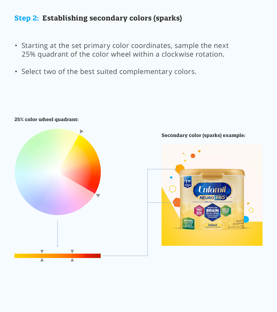
Creating primary and secondary product colors
When establishing colors for new products or non-established markets, the primary color and/or hex edge must be set first. Secondary colors, which are used for both sparks and backgrounds, will be determined by the set primary.A primary color should be chosen based on the focal tone of the product’s packaging and cannot be deviated from when setting the corresponding color value range. Since the hex edge often acts as a content container, it should be warm, yet vibrant, while taking into consideration copy variations ranging from large headlines to small-scale legal.
The secondary colors should be complementary to the set primary color, so they should never contrast or conflict with it.

ICONOGRAPHY
All icons are built by leveraging the same geometric shapes used for Wonder Sparks. The hexagon is the foundation, with the secondary elements built in to create ownable iconography.
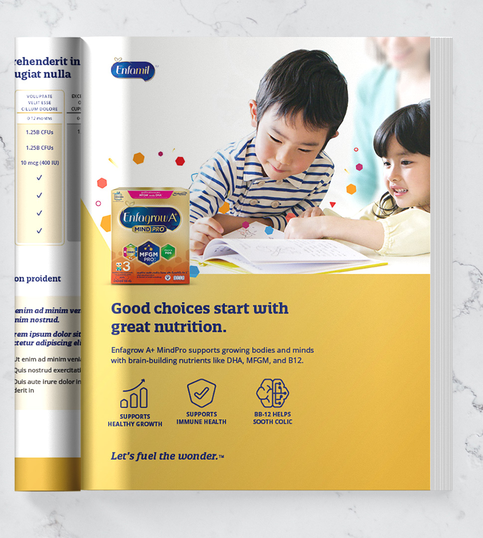
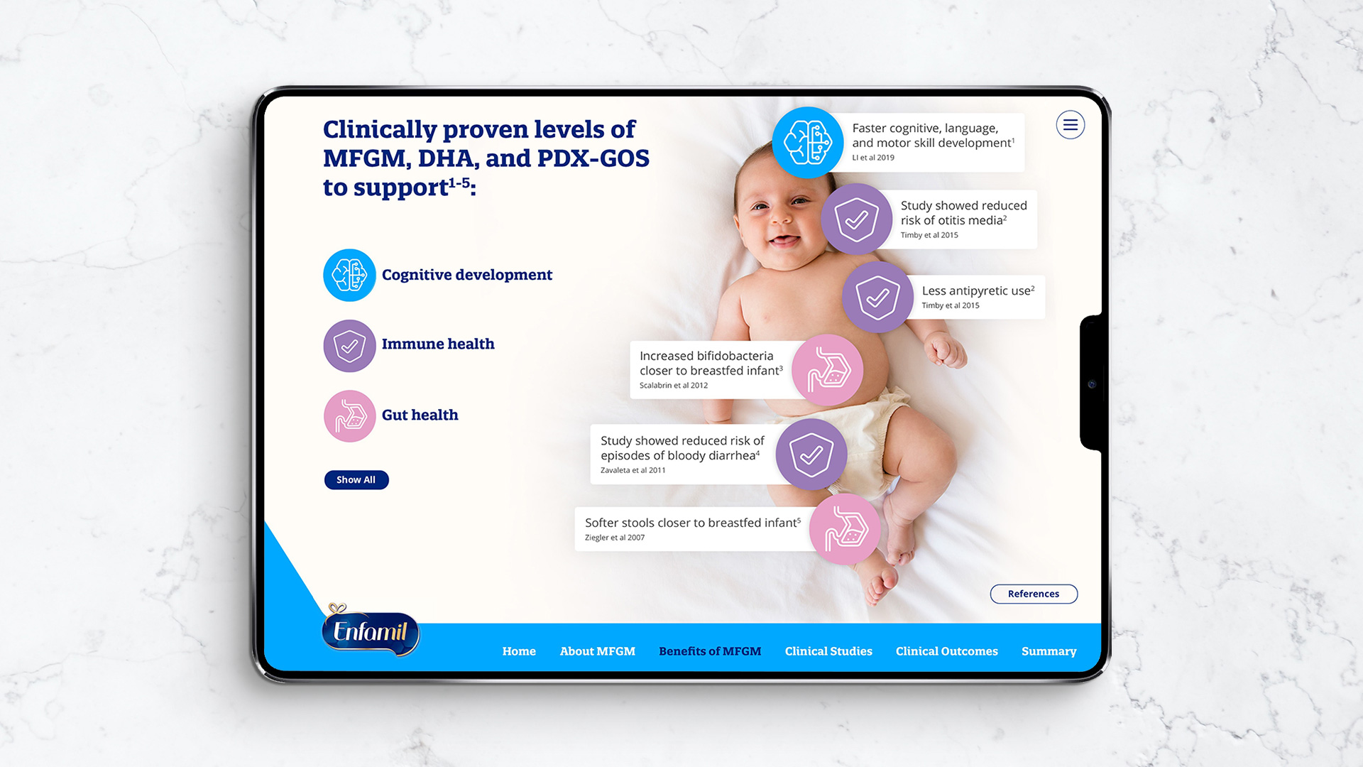
KEY VISUALS
A templated system that can be flexed and guide customization to meet the needs and objectives of global markets across channels.

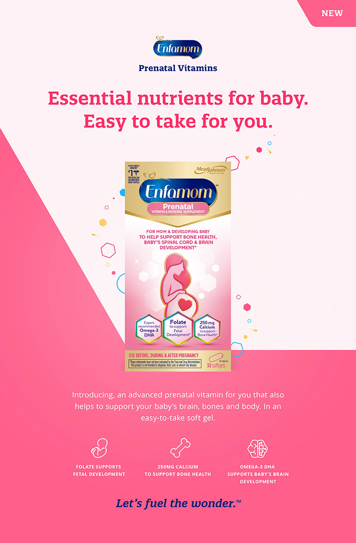
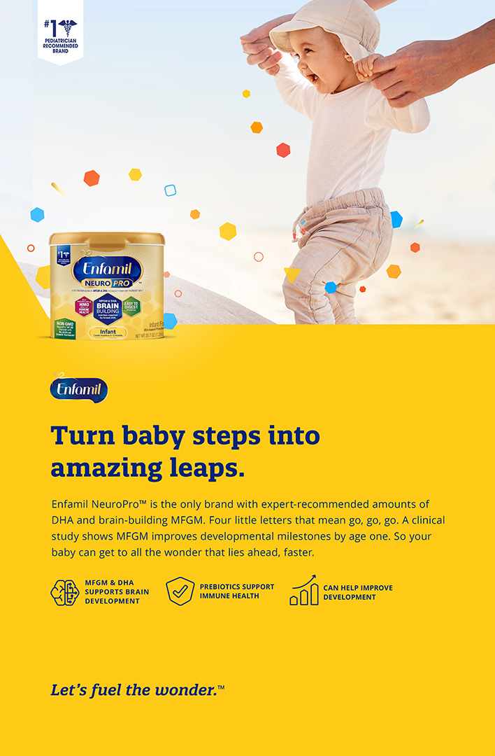


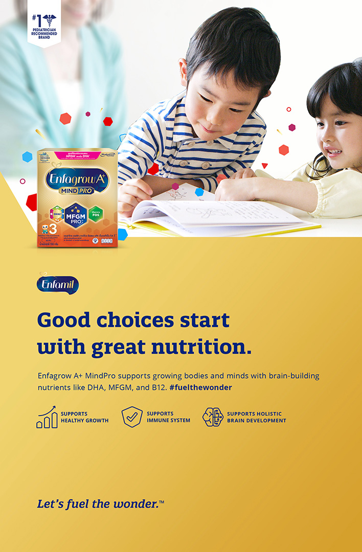


TOUCH POINTS
To inspire global markets, here are examples that illustrate the brand design system in marketing across various touch points. These are not supposed to be scripted examples. Markets determine the best use cases.